


Choosing the Right Pixel Pitch for LED Walls in Reception Areas
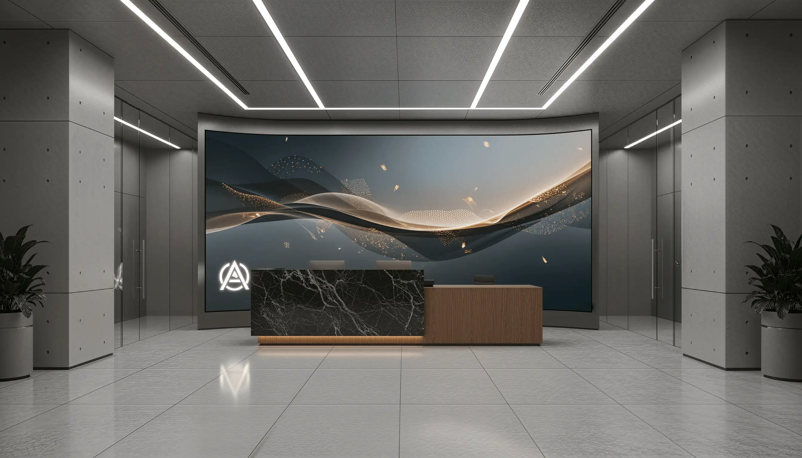
In the reception area, it quickly becomes clear whether information is understood — and whether an LED wall is perceived as calm, high-quality, and easy to read, or visibly pixelated and tiring. For decision-makers, pixel pitch is a typical pitfall: it appears to be a simple metric, but in practice it determines readability, content suitability, and investment security.
The most common misconceptions lie at both extremes: if the pixel pitch is chosen too fine, costs increase significantly, even though the resolution gain is often imperceptible at the actual viewing distance. If it is chosen too coarse, readability and brand impact suffer — especially for logos, taglines, wayfinding information, or changing greetings. Both are critical in the reception area, because the display is permanently in view and any failures or quality defects are immediately noticeable.
This article shows you practically how to determine the pixel pitch for LED walls in reception appropriately: based on viewing distance, room size, content types, ambient light, and budget. The goal is a selection that secures impact, readability, and operational reliability in the reception area on a lasting basis.
1) Viewing Distance and Room Geometry: The Most Important Metric for Pixel Pitch
The key point: in the reception area, what matters is not an "average distance," but the critical minimum viewing distance — where text must remain clear and pixel structure must not be distracting.
In a reception area, viewing distance is rarely constant. Visitors sometimes stand very close (check-in, waiting areas, access control), while others perceive the LED wall from a distance (entrance door, corridors, passages). For the pixel pitch decision, therefore, what matters is not the "average," but the critical minimum viewing distance: the distance at which text and edges must look sharp without pixel structure being noticeable.
As a rule of thumb: the smaller the pixel pitch (e.g., 1.2 mm instead of 2.5 mm), the better the display looks from a short distance. This is particularly relevant in reception situations with narrow passages, glass vestibules, or queues that automatically bring visitors close to the display. If the minimum possible viewing distance is, for example, 1.5–2.0 m, finer pixel pitches are typically more appropriate than in spacious lobbies, where the first viewing occurs only from 4–6 m away.
Room geometry additionally influences perception. The most relevant factors are:
Practical example: A technology company is planning a 3.0 m wide LED wall in the reception area, directly behind the check-in counter. When checking in, visitors are sometimes only 1.2–1.8 m away. Here, the pixel pitch makes the difference between a "premium display" and visibly coarse pixelation. In the same company, a second LED wall in the foyer corridor, viewed primarily from 5–8 m away, would be sufficient with a larger pixel pitch without losing functionality.
Typical decision questions you should clarify internally:
Market trend: In reception areas, demand is rising for "all-in-one" LEDs and finer pixel pitches, because companies increasingly view display surfaces as part of interior design. At the same time, there is more precise calculation of whether the additional cost of a very fine pitch is actually visible in real space. The best pixel pitch, therefore, is the one that cleanly serves the minimum viewing distance, not the technically maximum possible one.
2) Content in the Reception: Text, Logo, Wayfinding, Video — and What This Means for Resolution
The key point: video is often more forgiving of larger pixel pitch, while text, logos, and pictograms immediately expose coarse pixelation.
Content determines how "forgiving" an LED wall is. Video and large-scale image content often work convincingly even with larger pixel pitch, because moving content and organic structures mask pixel structure. However, in reception areas, text, logos, pictograms, and sharp edges are often crucial. These specific content types quickly reveal weaknesses of pixel pitch that is too coarse.
If you want to display changing messages in the reception area (visitor greetings, event agendas, wayfinding, safety information), you need not only sufficient brightness, but especially clear typography. Thin fonts, small capitals, fine lines, and high-contrast edges look frayed or difficult to read when pixel pitch is too large. A common practical problem: marketing provides corporate fonts with very fine stroke widths; on a coarsely pixelated LED wall, quality visibly degrades, even though the design looked perfect on screen.
Logos are similarly critical. Many brands work with diagonals, curves, or negative spaces. With too large a pixel pitch, curves appear angular, and proportions change. This is precarious in the reception area, because the LED wall is usually intended as a "brand anchor." For purely decorative motion graphics, compromises are acceptable; for a permanently visible corporate logo, they are not.
Practical example: A consulting company wants to display daily greetings with visitor names and meeting rooms on the LED wall. Additionally, a subtle video backdrop runs. Here, text readability is the hard criterion. A coarse pixel pitch might still look good for the video, but names appear blurry or flickering, especially with thin fonts. A pragmatic solution is to consistently use LED-optimized typography in the content workflow (larger font sizes, higher stroke widths, clear contrasts) and choose the pixel pitch so that these standards reliably function at the minimum viewing distance.
The method of content delivery also plays a role. If content comes from PowerPoint, office tools, or CMS systems, it is often not optimized for native LED resolution. A finer pixel pitch LED can display more detail, but only if the signal chain (player, scaling, image format, color management) is cleanly implemented. Otherwise, you pay for resolution that goes unused in daily operations.
Typical decision questions on the content side:
- Which content types dominate: text/wayfinding, logo/brand identity, video, live data (KPIs), interactive elements?
- What minimum font size is needed in the reception area (e.g., names, time, notices)?
- How often do contents change, and who supplies them (marketing, assistant, facility, agency)?
- Are there brand guidelines for font weights, logo protected spaces, color values?
Market trend: many companies increasingly use the LED wall in the reception as a "digital signage hub": greetings, ESG statements, safety communication, employer branding. This mix increases the likelihood that text and logos become critical. Therefore, pixel pitch selection should not be based solely on video demos, but on realistic brand layouts, tested at actual viewing distances.
3) Ambient Light, Viewing Angles, and Surfaces: Why Reception Areas Have Different Requirements Than Conference Rooms
The key point: in the reception area, daylight, reflections, and movement shift focus from pure "sharpness" to contrast, readability, and calm appearance under real conditions.
Reception areas are often bright and architecturally open: glass facades, automatic doors, daylight, reflective floors, and changing lighting moods throughout the day. This environment influences how an LED wall is perceived, and indirectly the choice of pixel pitch. With strong ambient light, requirements for contrast, black level, and homogeneity increase. Higher resolution alone does not solve these issues, but together with appropriate LED technology and calibration, it can significantly improve overall appearance.
A typical planning error: pixel pitch is evaluated based on showroom demos in controlled environments. In the actual reception area, the image then appears flatter, because scattered light raises the black level. Especially with dark brand colors or elegant, minimalist designs, this can influence perceived quality more than a step up or down in pixel pitch. Therefore, when comparing, you should focus not only on "sharpness," but on readability and contrast under actual lighting conditions.
Viewing angles are also central in reception areas. Visitors move: they approach the display at angles, stand to the side, turn while waiting. An LED wall must therefore look good not just frontally. At larger pixel pitches, pixel structure can become more noticeable from oblique angles, while with finer pitches, edges appear quieter. At the same time, very bright settings can appear more glaring from oblique angles, which affects acceptance by the front desk team.
Surfaces and reflections are another practical factor. Matte, anti-glare modules reduce reflections, which in the glass and stone environment of reception areas is often more important than maximum peak brightness. If reflections are strong, a coarse structure can become additionally distracting, because light points and reflecting highlights overlap. When selecting, you should therefore not view pixel pitch in isolation, but as a package with surface finish, calibration, and brightness control.
Practical example: A company with a south-facing facade is planning an LED wall across from the glass front. In the morning, the room is very bright, in the afternoon, shadow patterns change. In such situations, you benefit from automatic brightness control and good anti-glare treatment, so that content appears stable. A pixel pitch that is too coarse can appear "harsher" at high brightness, while a finer pitch and a quieter image (clean dimming, uniform color temperature) appears more professional.
Typical decision questions around ambient light and perception:
- How much does daylight vary (glass facade, skylights, automatic doors)?
- Are there reflective materials in the field of view (stone, glass, high-gloss furniture)?
- Where do staff members stand who are constantly looking at the display (glare, fatigue)?
- Must the LED wall provide clear information even when viewed from the side?
Market trend: in modern lobbies, the demand for "display as architectural material" is rising. This makes homogeneity, contrast, and reflection behavior increasingly important. For the decision on pixel pitch for LED walls in reception, this means: pixel pitch is a core factor, but perceived premium quality emerges only through the interplay of light management and surface choice.
4) Budget, Operations, and Future-Proofing: Choosing the Economically Right Pixel Pitch
The key point: the right pixel pitch is the one that covers your use cases in the reception area while also enabling a sustainable operational model (service, content, operating time).
Pixel pitch is one of the strongest cost drivers, because as pitch decreases, the number of pixels per square meter increases. More pixels typically mean more LEDs, more complex control, higher requirements for power, thermal management, and signal processing. For B2B decision-makers, therefore, not only the purchase price matters, but the total cost of ownership: energy, service, spare parts strategy, operating time, and the ability to display new content in the future without quality loss.
Economically sensible is a pixel pitch that fulfills real use cases in the reception without paying for "dead capacity." A too-fine LED wall can be economically questionable in the reception if visitors rarely come closer than 4–5 m, or if content consists almost exclusively of large-scale video. Conversely, a pitch that is too coarse is expensive if you later discover that text and wayfinding are not readable enough, and the display fails its purpose. In reception areas, retrofitting is often difficult, because the display is part of the interior buildout.
A practical approach is to think of the budget in three blocks:
- Display quality (pixel pitch, brightness, calibration)
- Operational reliability (redundancy, service access, spare modules, monitoring)
- Content and control layer (CMS, player, interfaces)
Often, pixel pitch is "increased," while operations and content are cut. This results in a display that is theoretically very high-resolution but struggles in daily operations with poorly scaled content or long downtimes.
Practical example: a mid-size company is planning an LED wall as a central brand touchpoint in the reception. The budget allows either very fine pixel pitch without redundancy, or a slightly larger pitch with better service accessibility, spare parts package, and reliable CMS. For a reception that is used daily, the second option often provides better investment security. The reputational damage of an outage in reception typically exceeds the benefit of one resolution step, which is barely perceptible at actual viewing distances.
Future-proofing also concerns content requirements. Many companies start with image content and later add greetings, live data, room occupancy, event handling, or multiple languages. This increases requirements for typography, information density, and layout. If you dimension too tightly today, the display can seem "too coarse" in two years. Conversely, you should avoid investing in extreme resolution if the signal chain (player, CMS, network) cannot keep up.
Typical decision questions regarding economics:
- How critical is the LED wall for daily reception operations (outage tolerance)?
- What service and spare parts strategy is planned (SLA, modules, front/rear access)?
- What content is planned today and what is realistically expected in 12–24 months?
- How well is the organization equipped to maintain content cleanly (processes, responsibilities)?
Market trend: alongside pure image quality, "operational excellence" is gaining importance. Monitoring, remote support, planned maintenance, and reliable spare parts availability are decision-relevant. The economically right pixel pitch for LED walls in reception is therefore the one that meets user requirements while enabling a robust operational model.
The right pixel pitch determines the impact of your LED wall in the reception area. Now configure your LED wall — tailored to room size and viewing distance.
FAQ and Conclusion: Making Confident Decisions on Pixel Pitch for Reception LED Walls
What pixel pitch range is typically appropriate for reception areas?
Reception areas often span a range from relatively close to medium viewing distances. What matters is the actual minimum distance at stopping points like counters or waiting areas. The closer people stand permanently, the more worthwhile a finer choice, especially for text and logos.
Is it enough to decide based only on viewing distance?
No. Distance is the most important starting point, but content types (text/logo vs. video), ambient light (contrast, reflections), and signal quality influence how "high-quality" an LED wall actually appears. In reception areas, it also matters whether staff constantly look at the display and whether glare is avoided.
What are typical selection errors?
Decisions are often made based on demo videos rather than testing with actual brand layouts and text. It is also common to buy very fine resolution, but the CMS and content processes are not designed for it, causing content to scale poorly or be incorrectly formatted. Another mistake is underestimating operational reliability and service access, even though the reception display is critical to reputation.
How do I test readability meaningfully?
Use real content: logo, tagline, greeting texts, wayfinding, event agendas, and typical videos. Check these at the minimum viewing distance and under actual lighting conditions (daylight, evening light, reflections). Pay attention to edge calmness, flicker-free appearance at typical brightness levels, and readability from oblique angles.
Is the most expensive solution automatically the most future-proof?
Not necessarily. Future-proofing results from appropriate pixel pitch plus robust operational and content architecture: reliable players, stable signal routing, monitoring, service concept, and clear responsibilities. An LED wall that always works and is consistently updated often delivers more value in reception than theoretically higher resolution with operational weaknesses.
What measurement values should be documented when accepting a reception LED wall?
Document brightness (cd/m²) in typical daylight, measured contrast values, viewing angle homogeneity, and lux and reflection measurements; additionally, testing with key brand content is recommended. Supplement this with a deviation analysis against specified target values for black level, color temperature, and glare-free operation, so that service and monitoring remain traceable later.
How do I define a minimally readable font size for my application?
Determine the minimum necessary font size by testing sample texts (names, taglines, wayfinding) at the critical minimum distance, ideally with the actual fonts and stroke weights used. Then document results in millimeters or points and use these specifications for content checks in the CMS, so new content always meets the readability threshold.
Which aspects are critical for the operational reliability budget portion?
Assess service paths (front vs. rear access), spare parts storage, module sizes, and monitoring/remote support concepts; consider SLAs for MTTR/MTBF and how downtime impacts reputational effect in reception. Only when these metrics are predictable can pixel pitch be factored in as part of a sustainable operational model.
How do I plan the content pipeline for high-resolution LED walls correctly?
Define the workflow from content authoring through appropriate players/media servers to scaling in the LED controller; ensure native output resolutions and avoid unrealistic subsampling cases. Establish clear responsibilities for templates, brand elements, and testing at minimum distance, so finer resolution is not undermined by inconsistent signal delivery.
What role do signal architecture and hardware play in fine pixel pitch?
Fine pixel pitch requires appropriately powerful controllers, image processors, and transmission paths (e.g., multi-channel HDMI/SDI/UDP with adequate bandwidth). Ensure the hardware supports native resolutions, delivers consistent refresh rates, and enables scaling without artifacts, otherwise the high LED density remains unused.
How can I plan for future requirements without over-dimensioning?
Use scenario analysis: what content is planned today, what expansions are likely in 12–24 months (e.g., live data, multilingual greetings)? Set thresholds for when text/logos demand additional capabilities and keep service and CMS suitability in view. This way, you choose a pixel pitch that reliably handles both current and foreseeable content without carrying operational ballast.
Conclusion: Choose pixel pitch for LED walls in reception best starting from actual minimum viewing distance, validated with your typical content and under your lighting conditions. Plan pixel pitch not in isolation, but together with surface choice, brightness control, signal delivery, and operational concept. This ensures your LED wall in reception not only impresses, but remains permanently readable, reliable, and economically sound.
Further Articles
Learn more about related topics: